A Splash Of Colour: A Guide To A Bold Yet Sophisticated Home
- Acid Papaya Magazine
- Oct 4, 2021
- 5 min read

Embracing Colourful Interior Design: A Guide To A Bold Yet Sophisticated Home
Colourful interior decor can merge a bold and vibrant aesthetic with elegant and sophisticated pieces, giving a home an eclectic flair without being kitschy. Vibrant, colourful designs understand the enormous psychological effects that colour can have in our lives. If you aim to have a bright and bold aesthetic in your home which showcases your distinct personality, incorporating colourful pieces in your home could be for you.


The Psychology of Colours
An article by the London Image Institute (londonimageinstitute.com) denotes the manner in which colour is used as a non-verbal communication method. Colour plays a pivotal role in creating certain moods and influences the way in which people make decisions; it is thus important to know what emotions and thought processes certain colours will invoke through the use of colour psychology. Colour psychology is a popular area of colour theory that assigns emotional and psychological connotations between colours and emotions. While some colours have specific cultural meanings, most have a universal meaning. Red, for instance, is thought of as a colour depicting excitement, strength, energy and love. Orange is associated with confidence, success, sociability and bravery. While the colour blue invokes the emotions of trust, peace, loyalty and competence. Black, on the other hand, elicits the emotions of formality, sophistication and security, as opposed to white, which represents cleanliness, simplicity, innocence and honesty. When trying to create an atmosphere using colour in spaces, think about integrating these elements of colour in interior design:
The Elements of Colourful Interior Design

Colour
The foundation of a colourful space is colour choice. Creating a balanced colour scheme requires a deep understanding of the colour wheel and the psychology behind colours. Colour harmonisation can balance bold statement colours with neutral colours and ensure that a room is visually appealing and cohesive.
Texture
The use of various materials, rugs, furniture, and fabrics can add a layer of depth to a space. Texture indicates the smoothness/look & feel of the room. This element also contributes to adding a sense of touch to the space by capturing the public attention. The softness of the fabric is considered the texture (dhyanacademy.com).
Light
Natural and artificial light can dramatically alter how colours are perceived. It can be used to highlight features, create ambiance, and enhance the overall mood of the space.

Pattern
Whether it is the use of wallpaper, textiles, or rugs, they add visual interest and can be used to create focal points or to unify a space. Patterns work hand in hand with colour and texture, adding rhythm to interiors through repetition.
Form
Form refers to the shapes and outlines of objects in a room. Different forms, like geometric or organic shapes, can create different visual experiences. Combining different shapes creates a sense of contrast and visual interest.
Line
Lines, whether implied or actual, guide the eye and can be used to create a sense of movement, space, or balance within a room. Horizontal, vertical, and dynamic lines help to shape a room and guide the eye.

Positive and Negative Space
The Role of Positive and Negative Space. Positive space refers to areas filled with objects, like furniture or decor. Negative space is the empty space around and between these objects. The Seven Elements of Interior Design (sketchdesignstudio.com) states that too much positive space can make a space feel cluttered, whereas a space with too much negative space can make a space feel cold, sparse, and uninviting.
Incorporating Colour in Interior Design
Artwork
Art is a great way to add colour in a space. This can be achieved by choosing an artwork with a colour palette that you really love and that can inspire you to purchase and incorporate the colours within the artwork into the space. Large-scale art can act as a colour focal point, while smaller works build layered nuance.


Layered Rugs
Rugs are a great way to add colour, texture and warmth on the ground level. Layering different patterns or tones creates depth and visual interest; for example, mix materials such as wool, jute, and flatweave to vary sheen and depth. Consider rugs with accent hues that echo the room's dominant colours.
Use Tile
Tiles offer high impact in kitchens, bathrooms, and feature walls. They come in endless colour combinations and finishes: glossy, matte, and mosaic. Bold tiles can become artful statements, while subtle ones can support the broader palette.


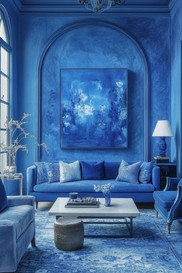
Go Monochromatic
This involves using one hue in varied tones and textures. It's soothing and stylish; think light blue walls, navy furnishings, and denim textiles. Break up visual monotony with contrast in materials: velvet, metal, and wood. All of this can be achieved by painting walls in the lightest tint, then layering furniture, curtains, and accessories in deeper tones. Implementing contrast through glossy and matte finishes, for example, think satin-painted walls with velvet cushions in the same hue. Introduce visual breaks with metallic accents (brass lamps, chrome frames) to avoid flatness.


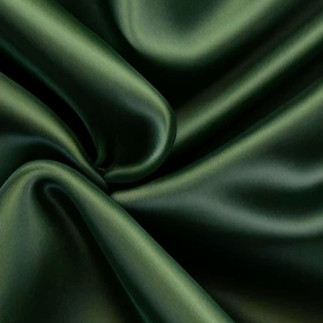
Jewel Tones
Rich, vibrant hues like emerald, sapphire, and amethyst bring drama and elegance. Use them sparingly for impact: a velvet chair, cushion, or wall accent. They pair beautifully with metallics like brass or gold for luxe vibes.


Custom Furniture
Tailored pieces can embody your ideal colour scheme. Upholstery allows creative freedom; think colour-blocking or bold piping. Painted finishes, wood stains, or lacquers offer even more customisation. Select upholstery fabrics in signature hues or bespoke colour-blocked patterns. Ask a carpenter to paint built-ins or side tables in complementary shades to other room elements. Integrate unexpected pops of colour: interior drawers, cabinet backs, or chair legs painted in bright accent colours.


Section Rooms with paint colour
Open plans gain structure when you use colour to define zones. For example, a soft green reading nook beside a terracotta dining area. Play with ceiling colours or painted shapes on walls for creative divisions. Think about painting a dining alcove in terracotta while keeping the living area in soft sage. Apply a darker ceiling colour above a reading nook to cocoon the space visually. Use painted “arches” or vertical stripes on walls to hint at separate functions without physical dividers.
Use Complimentary colours
Opposing hues on the colour wheel energise a room through dynamic contrast. These are colours opposite on the colour wheel (e.g., blue and orange). They energise a room by creating dynamic contrast. Balance is pivotal; use one dominant colour and the other in accents (pillows, art). Anchor dominant furniture pieces in one colour (e.g., mustard sofa) and layer cushions in its complement (deep teal). Integrate small accessories in the form of vases, art frames, and throw pillows in the opposite hue to balance and enliven. Maintain harmony by letting one colour occupy roughly 60% of the scheme, the other 30%, with neutrals at 10%.
Additional Information
To elevate your design even further, consider:

The Lighting: Warm bulbs deepen jewel tones, while cool LEDs sharpen monochromatic palettes.
Textiles and Drapery: Sheer panels can soften bold wall colours, and patterned curtains introduce secondary hues.
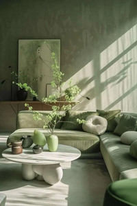
Botanical Accents: Greenery works with nearly every scheme; think sculptural ferns in coloured pots.
In summary, a colourful design style encourages you to be bold and to embrace uniqueness. By blending all these elements to achieve a bold aesthetic, one can craft a home that is both sophisticated and vibrant.


Comments